| 25 January 2021
The globXblog logo is a colourful doughnut that mimics an equaliser, referring to the sonification and visualisation part of the blog. In its core, a stormy icon represents the hydrological part of the blog. The equaliser is surrounded by a globe stand, in reference to global scale hydrology.
The dataset behind the logo
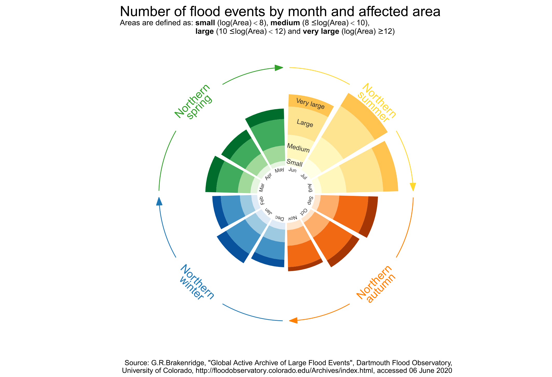
The main element of the blog’s logo is drawn from an actual dataset of flood events that occurred between January 1985 and June 2020. Each bar symbolises a month and its height depicts the number of flood events that began during this month. The bar colours represent the four seasons, whereas the colour shades denote four categories of flood-affected area. The categories, from small to very large, have been defined arbitrary to get a nice visual outcome.

Turntabling the logo
To capture the evolution of the number of flood events year after year, the logo now comes to life in a sonified animation. It grows month by month while spinning as a turntable. A grey cone indicates which month is played.
Sonification is performed by sequencing a few sounds evocative of the content of this blog: four notes inspired by the blog’s name (G-loB#-B-loG becomes G, low C, B, low G) along with drums, cymbals and water sounds. There is also some noise and randomness in this sonification process, just as in the data used in the blog!
Authors: Chloe (figure, animation, writing) & Ben (sonification)
Codes and data: browse on GitHub

