Folding and bending data
In the fun with dendrograms post, a linear dendrogram is gradually bent into a full circle. This transformation isn’t specific to dendrograms and can be applied to any dataset.
In the fun with dendrograms post, a linear dendrogram is gradually bent into a full circle. This transformation isn’t specific to dendrograms and can be applied to any dataset.
The globXblog logo is a colourful doughnut that mimics an equaliser, referring to the sonification and visualisation part of the blog. In its core, a stormy icon represents the hydrological part of the blog.
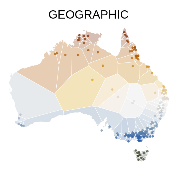
The map in the figure below shows the location of 195 hydrologic stations, which can be used to explore the hydrologic regimes of Australian rivers.
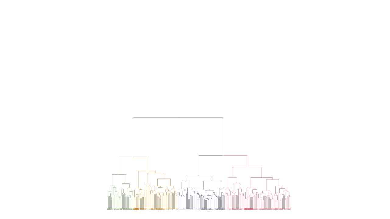
A dendrogram is a way to visualise objects organised in a hierarchy. It looks like a tree where: the leaves represent the objects of the dataset; the branches link similar leaves according to a given criterion.