
| 11 April 2021
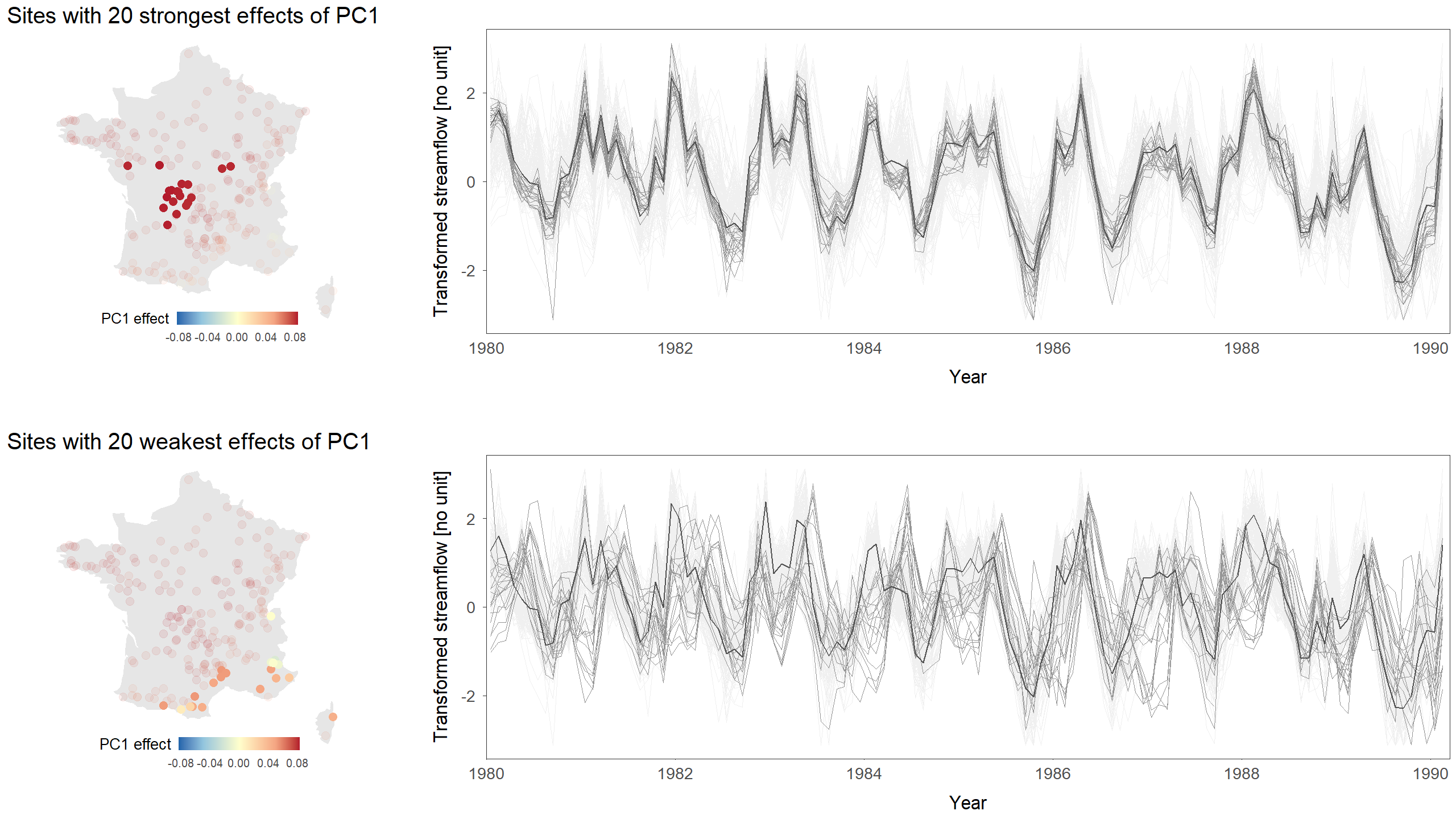
In hydrology, it is frequent to analyse long time series coming from many sites. The figure below shows monthly streamflows at 207 sites in France for the period 1969-2014. Original data have been transformed to make the time series more comparable between sites. A value close to zero means streamflow is close to the median flow at this site. A large positive value means streamflow is high for this particular site, and inversely for a negative value.
![]()
The figure is difficult to interpret due to the high number of entangled lines (one line per site). However, many sites seem to follow a similar temporal pattern.
Make my funk the PC funk
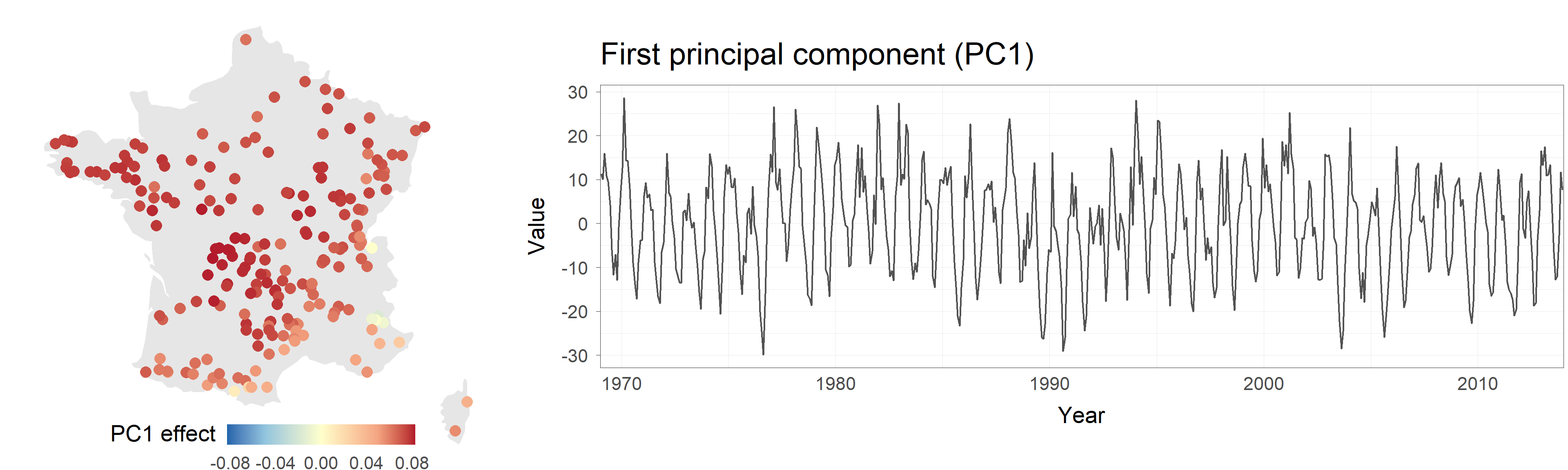
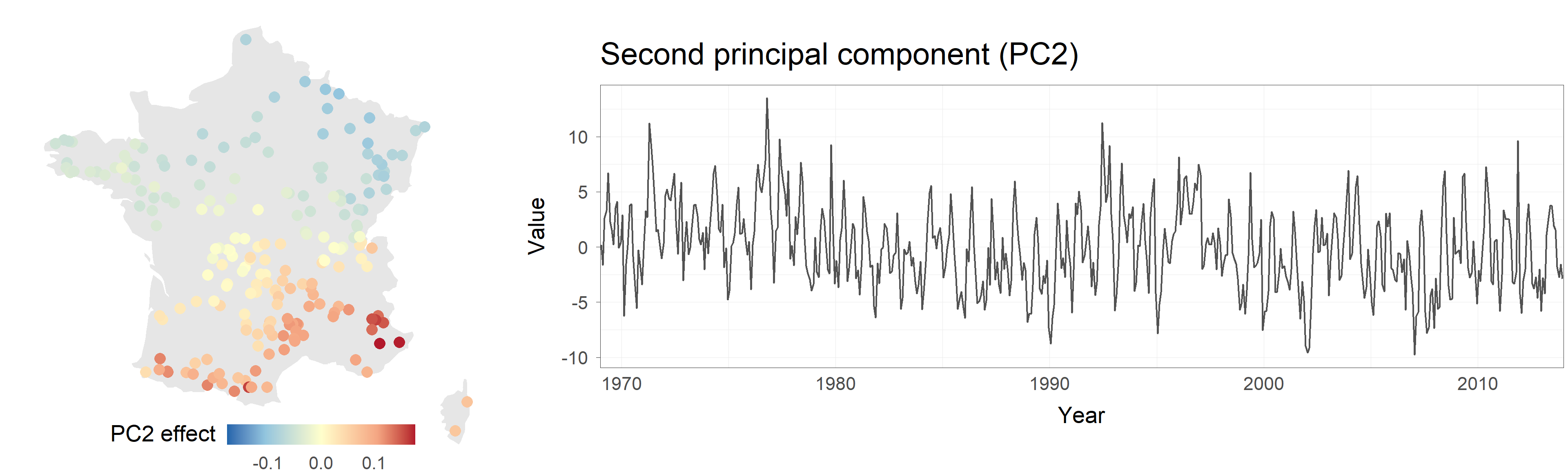
Another way to interpret the results of PCA is to visualise the original dataset while listening to the components. In the sonified animation below, the map on the left shows the original data while the time series corresponding to the first two components are shown on the right. The first component controls the pitch and volume of an electric organ. The second component similarly controls a piano.
The role played by the first component can be heard quite clearly: high-pitched organ notes correspond to drought episodes across a large part of the country, lower notes correspond to particularly wet months. While more difficult to interpret, the role of the second component can also be heard by focusing on the piano notes and watching the southeastern corner of the country.
Moving beyond Principal Components Analysis
PCA is a very general method that can be applied to a wide variety of problems. It is commonly used as a preliminary tool to explore and interpret large datasets (not necessarily space-time datasets such as here). However, it is not built to answer questions framed in terms of probabilities. For instance, a national water agency might want to know the probability of having a drought over more than 75% of the country, as such large-scale events may have negative consequences for irrigation, drinking water, etc. PCA cannot directly estimate this probability because it is lacking an explicit statistical model. Probabilistic versions of PCA have been developed to remedy this. They also offer additional benefits such as a better handling of missing data, the ability to quantify uncertainties and more. We are developing such probabilistic models as part of the HEGS project.
Authors: Ben (sonification, writing) & Chloe (figures, animation, writing)
Codes and data: browse on GitHub