| 14 June 2020
Mapping data to visual or auditory properties
A common visualization technique is to use the color or size of symbols to represent data. The bubble map below shows an example.
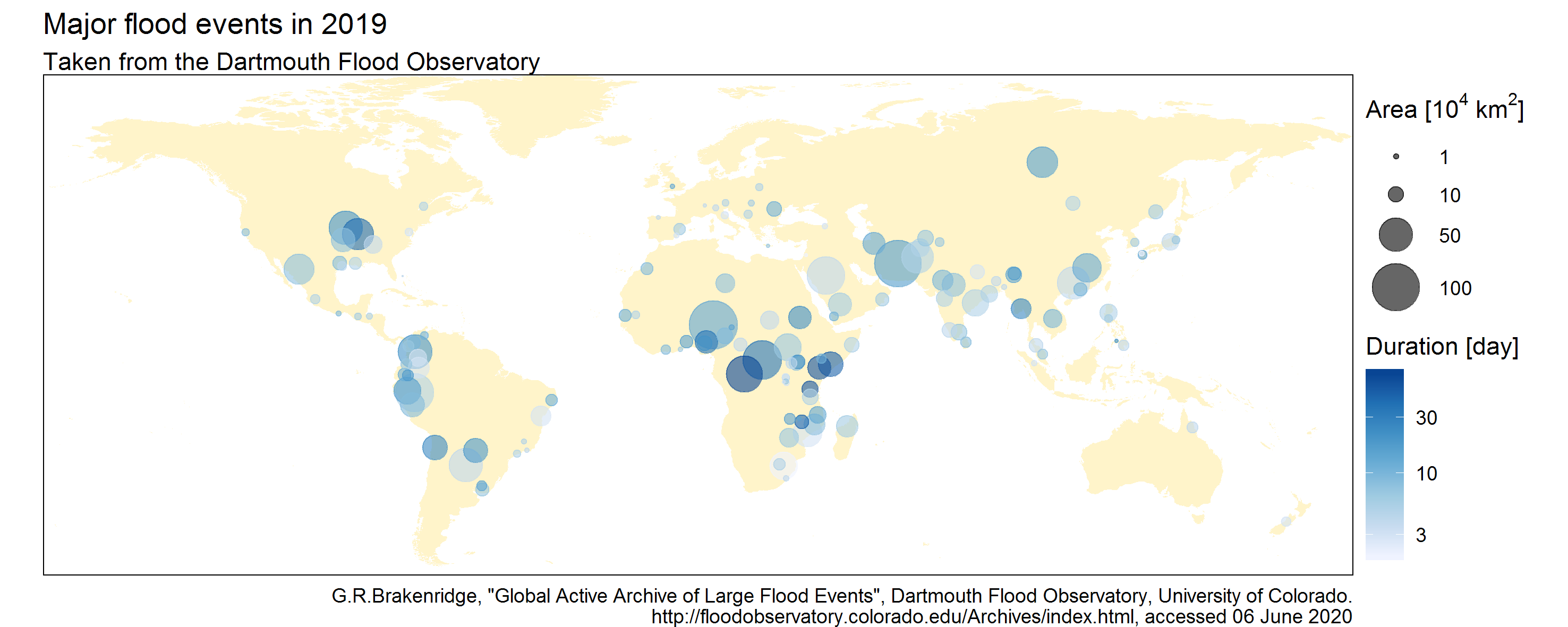
This figure visualizes the main flood events of 2019 as points on a world map. For each event, the flood-affected area is represented by the point size, while the flood duration is represented by the point color. This is an illustration of the basic data visualization technique called aesthetics mapping: data values are mapped onto some visual properties of the plot known as aesthetics (color and size of symbols here, but there are others such as transparency, symbol type, etc.).
A very similar approach known as parameter mapping can be used to sonify, rather than visualize, data. The idea is to represent data by using the properties of notes rather than symbols. In particular, the volume and the pitch of the note are the auditory counterpart of the symbol size and color.
Example: the Wagga Wagga melody
Times series are particularly well suited to pitch/volume mapping because their sonification leads to a succession of notes in time - that is, a melody. Consider for instance the times series of annual precipitation (in mm) and temperature (in °C) in the city of Wagga Wagga, New South Wales, Australia.
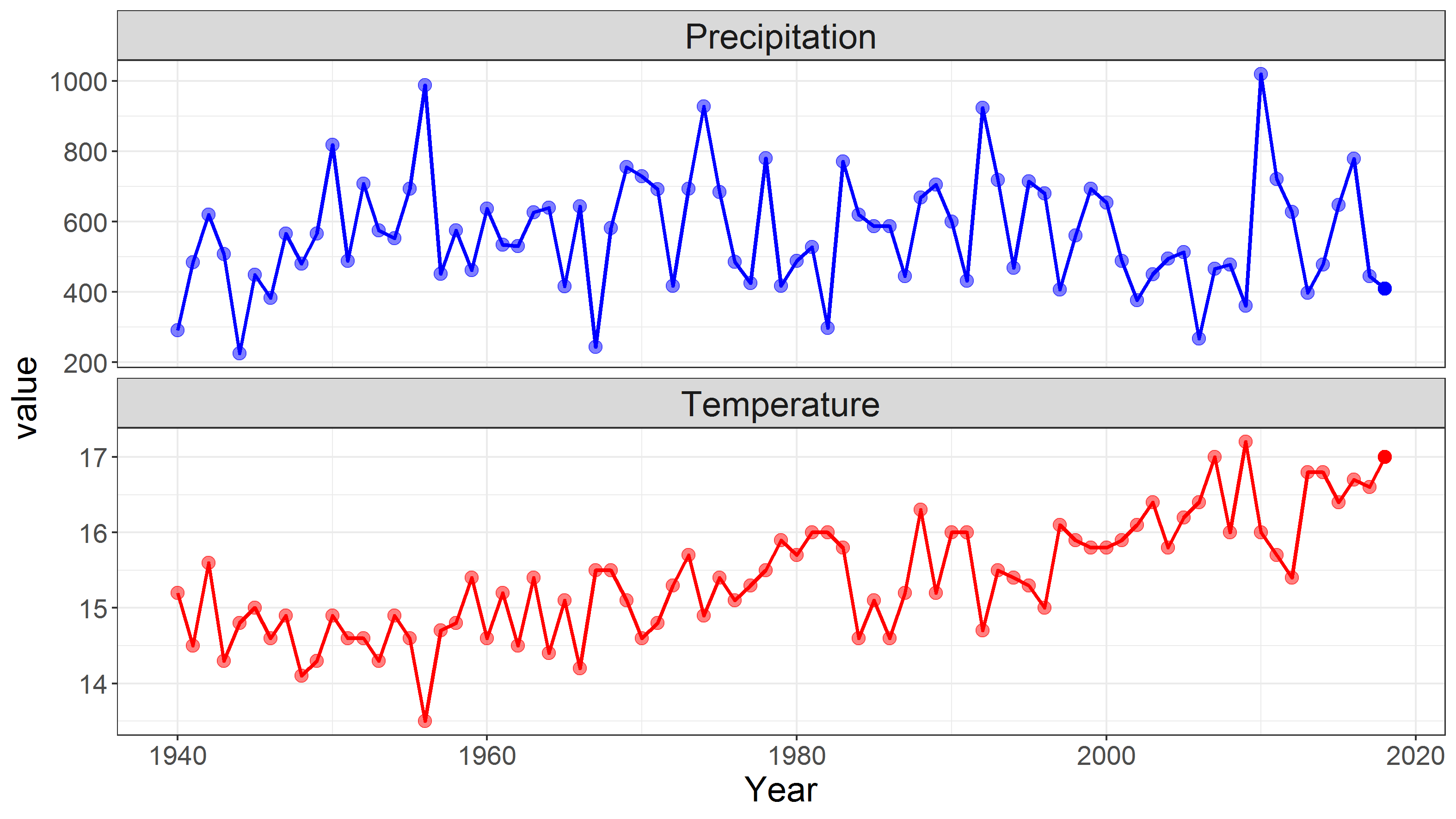
A possible sonification of this dataset is to map temperature to volume (so that warmer years correspond to louder notes) and precipitation to pitch (wetter years correspond to higher-pitched notes). More precisely, the temperature-to-volume mapping is set to create notes whose volume ranges from pianississimo (ppp) to fortississimo (fff); the precipitation-to-pitch mapping is set to create notes from a 2-octave A minor pentatonic scale (A C D E G).
The first video below shows the raw result of this sonification. The large year-to-year variability of precipitation leads to a rather ‘jumpy’ melody. Year-to-year variations in the temperature time series are more difficult to follow from the varying volume, but the warming trend can be heard quite clearly.
In the second video, some musical background is added. Pursuing the analogy with the bubble map shown at the beginning of this post, this corresponds to adding the background map to the points. In particular, a rhythmic pattern helps keeping track of the passing time. Some guitar chords and a bass line are also used in an attempt to make the result sounds nicer.
First thoughts
While the Wagga Wagga melody above is just a preliminary example, it already highlights some interesting aspects of the sonification process.
Sonification and musification: the Wagga Wagga melody was obtained by means of a two-part process. The first one is to create the notes from the data - this is the sonification part per se. The second one is to ‘arrange’ this raw melody by modifying the tempo, the instrument, or by adding some chords, a beat, etc. - possibilities are endless. Since this second part aims at turning sound into music, it could be described as ‘musification’. This is the most creative but also by far the most time-consuming part.
Melody: the musical scale into which data are mapped defines the melody and its choice hence largely determines the following steps. I found that musical scales containing only a few notes (e.g. 5-note pentatonic) are easier to work with than richer scales (e.g. 7-note scales). There is a strong analogy with the choice of the color scale in visualization: for instance, the distinction minor vs. major scales is similar to the distinction warm vs. cold color palettes.
Rhythm: regularly-spaced time series (e.g. daily, monthly, yearly etc.) lead to a rather poor rhythm since all notes have the same duration. A possible way around it would be to use duration mapping, but so far I found it quite difficult and my preliminary attempts turned out to be unconvincing. A simpler option is to link successive identical notes: this will be illustrated in future posts. The choice of the time signature is also important. For instance seasonal data naturally lend themselves to 4-beat rhythms; monthly data can naturally be grouped into waltz-like 3-beat patterns or more bluesy 12-note bars; daily data opens the way for more exotic 7-beat rhythms in order to hear weeks; etc.
Orchestration: as discussed in a previous post, sonification offers a promising way to explore several variables by mapping them into several instruments - in short, having data conduct a whole orchestra rather than just play a melody. The main difficulty is to find the right combination of variables, instruments and musical scales that make the ensemble ‘sound good’. So far my preliminary attempts often ended up in a messy juxtaposition of notes… but I’m not giving up!
How to do it? A few practical tools
For the sonification part:
- the Music Algorithms website is a very good place to start: it allows transforming a series of data into a musical file in MIDI format using pitch and duration mapping.
- in the R programming language, the package playitbyr provides a very nice interface for sonifying data with parameter mapping, but unfortunately it is not maintained any more. Interestingly, this package mimics the syntax of the ggplot2 package, which emphasizes once again the strong analogy between parameter-mapping sonification and aesthetics-mapping visualization.
- still in the R language, I am developing the musicXML package to transform data into a musical score in musicXML format.
- there are probably many alternatives in other programming languages: for instance MIDITime and Sonic Pi in Python, or the Csound system.
For the musification part, additional music software is useful to improve the raw result of a sonification exercise. For instance, the free and open-source MuseScore can be used to import and edit musical scores or MIDI files. I am personally mainly using the proprietary Guitar Pro.
Author: Ben
Codes and data: browse on GitHub