| 19 September 2020
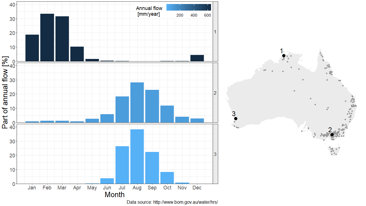
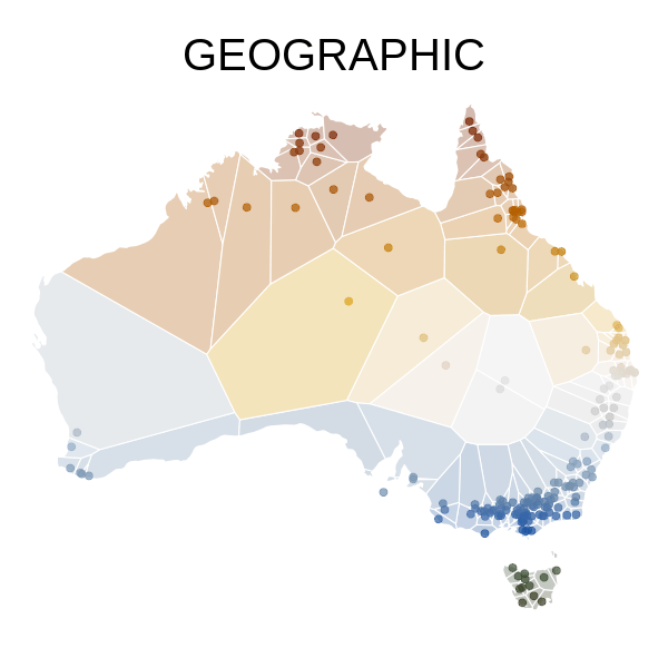
The map in the figure below shows the location of 195 hydrologic stations, which can be used to explore the hydrologic regimes of Australian rivers. The hydrologic regime is characterized by the flow seasonality, as shown for three particular stations on the left hand side of the figure. Stations 2 and 3 for example are quite similar in terms of hydrologic regime, despite being very far away geographically speaking.
The hydrologic similarity between any pair of stations can be quantified by defining a hydrologic distance (typically, the Euclidean distance between the 12 monthly values at each station). It is therefore possible to describe this dataset using either a geographic or a hydrologic distance. But is it possible to derive from the latter a hydrologic map, in addition to the geographic one?
Creating a map from distances: mission impossible?
Geographic distances can be computed from the geographic map, but creating the hydrologic map requires performing the opposite operation: given the hydrologic distance computed between all possible pairs of stations, how to draw the corresponding map?
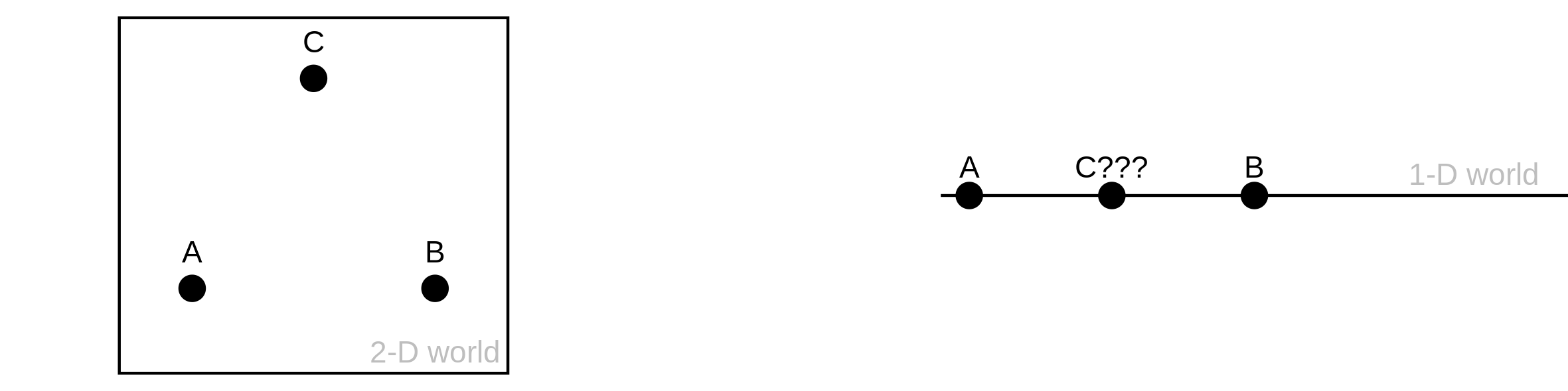
Unfortunately, this problem has no exact solution. The key issue is that the hydrologic distance is computed in a 12-dimensional world (the 12 months), and we’re trying to project these distances in a lower 2-dimensional world (the computer screen). As an illustration, consider the points A, B and C below represented in a 2-D world. The distance between any pair of points is identical. Now let’s try to represent these 3 points in a 1-dimensional world (a line). It’s easy to start with A and B, but where to put C? There is no solution that would respect the original 2-D distances in this 1-D world.
Creating an approximate map from distances
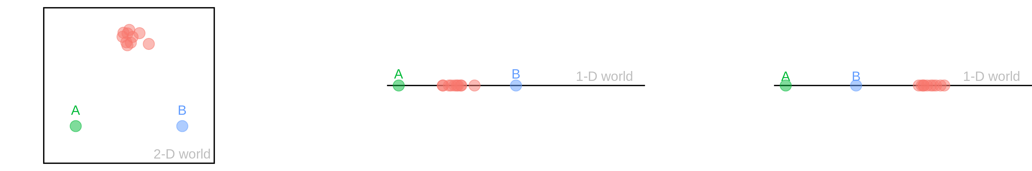
Consider now the figure below, where point C has been replaced by a cluster of red points. The 1-D projection in the middle is arguably better than the one on the right in the sense that A and B are at the same distance from the red cluster, as in the original 2-D configuration. In other words, it is not possible to respect all original 2-D distances between points, but it is possible to generate an approximate 1-D map that respects the overall geometry of the dataset, keeping close points together and representing longer distances with as much fidelity as possible.
In practice there exist several algorithms for this purpose, and there is no unique “best” solution. We are going to try two of them here: Isomap and t-SNE.
Mapping Hydrostralia
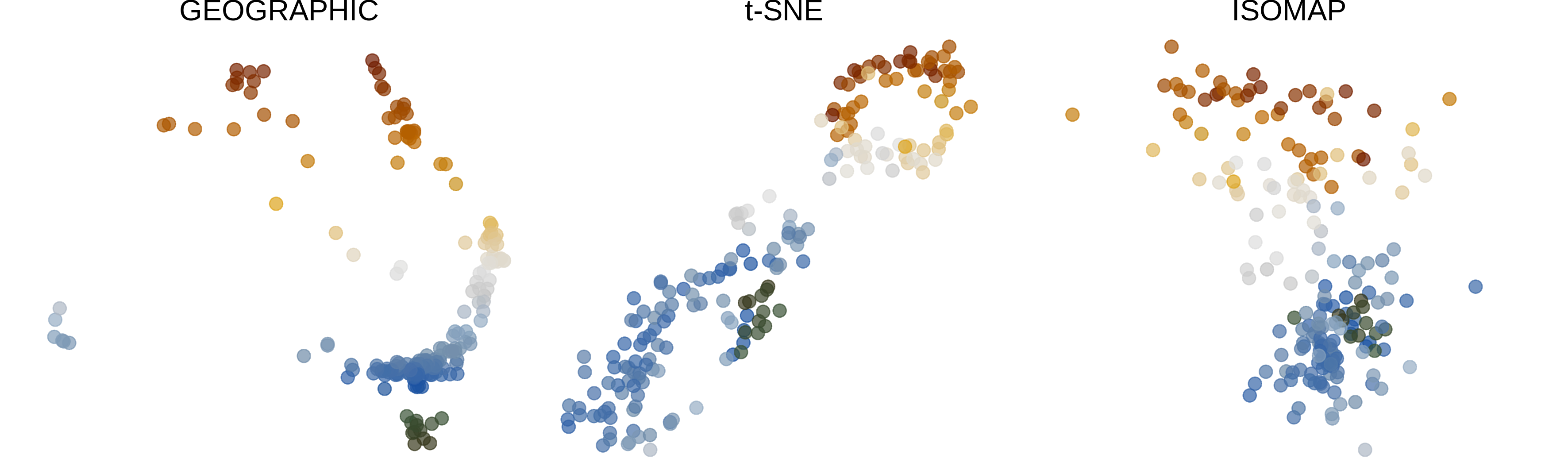
In the figure below, the map on the left shows the geographical location of the stations, with the color representing the latitude. The map reconstructed from hydrologic distances by the t-SNE algorithm is shown in the middle, and the one resulting from the Isomap algorithm is on the right. However, using the term ‘map’ is a bit of an exaggeration here – the figures just show the location of the stations, but where is the land?
Land can be added straightforwardly to the geographic map, but for the hydrologic maps the shape ‘suggested’ by the points needs to be drawn. Such a shape is known as a concave hull or a alpha-shape, and there exist algorithms to draw them automatically. In addition, a region associated with each station can be represented using a Voronoi diagram.
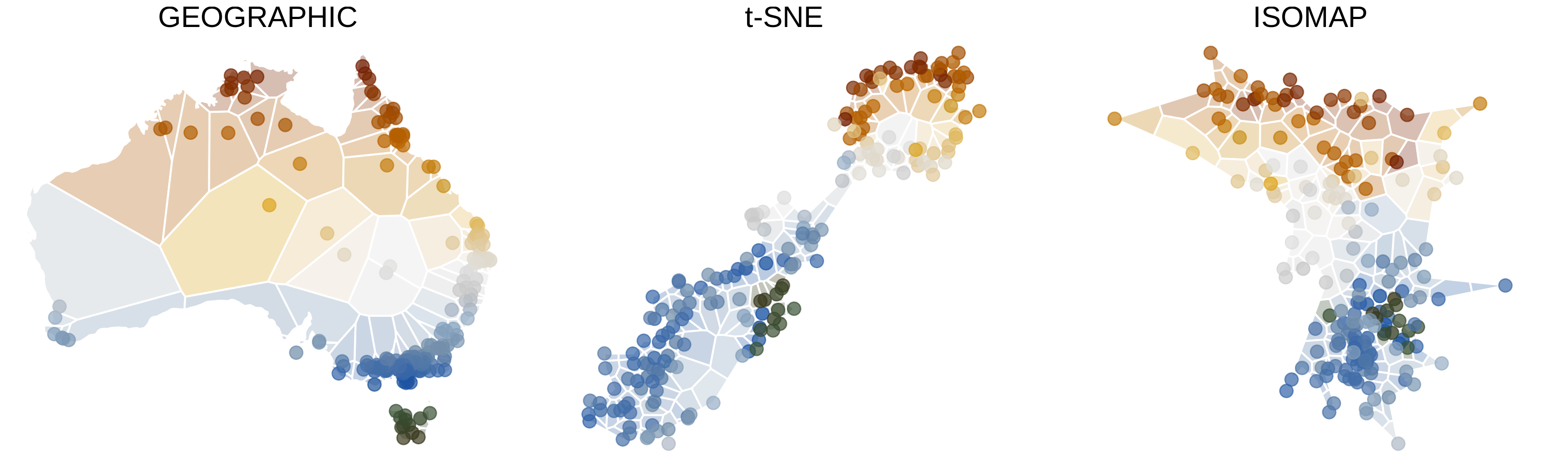
t-SNE Hydrostralia is composed of two islands: the smaller one comprises stations from tropical Northern Australia (where high flows occur during summer) and the larger one comprises stations from temperate Southern Australia (where high flows occur during winter). With a bit of imagination, it looks like New Zealand!
The map reconstructed with the Isomap algorithm looks quite different: it suggests a smooth transition between northern and southern stations, rather than a clear-cut two-island-like separation. However, both t-SNE and Isomap algorithms indicate that hydrologic regimes in Australia are strongly structured by latitude.
The figure above does not allow comparing the location of individual stations on the three maps because stations are only identified by color. This can be remedied by means of an animation that enables tracking the trajectory of any particular station as it moves between Australia, t-SNE Hydrostralia and Isomap Hydrostralia.
Author: Ben
Codes and data: browse on GitHub