| 20 July 2020
A dendrogram is a way to visualise objects organised in a hierarchy. It looks like a tree where:
- the leaves represent the objects of the dataset;
- the branches link similar leaves according to a given criterion.
Below are three animated dendrograms based on daily runoff data from the Australian reference dataset provided by the Bureau of Meteorology. They serve no purpose but to play with the dendrogram object since results are already discussed in the post about flow seasonality in Australia.
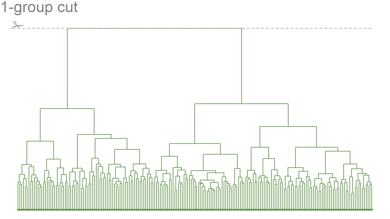
Linear dendrogram
The most standard representation of a dendrogram is to align its leaves at the bottom of the plot. Here, leaves are streamflow stations and branches link stations with similar flow seasonality. The linear dendrogram is successively cut into 1, 2, 3 or 4 groups following the dotted line. The point colour corresponds to one particular group.
Circular dendrogram
Another way to draw a dendrogram is to connect the two ends of the linear dendrogram baseline. The leaves are now forming a circle all around the branches. Here, a new information is added: the point size represents the annual quantity of water.
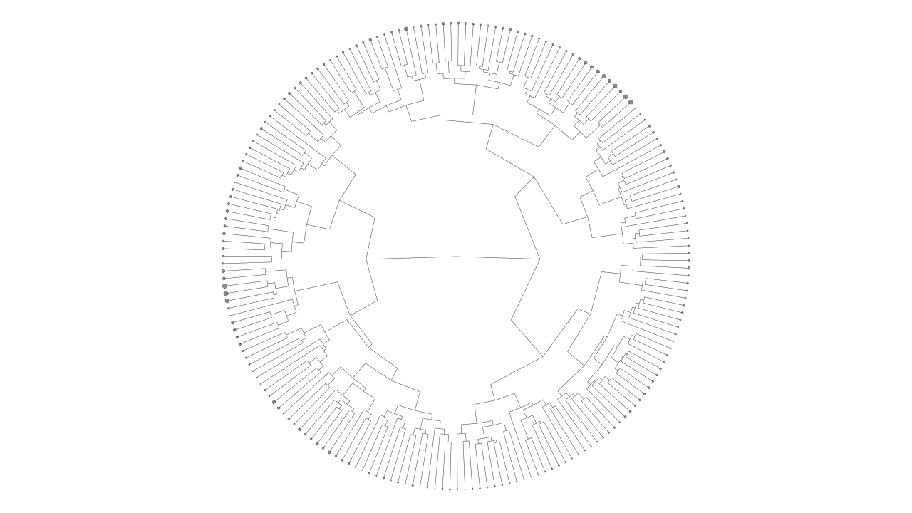
What does it look like when the dendrogram goes from linear to circular?
Bending a dendrogram
The 4-group linear dendrogram baseline is gradually bent to form a full circle ultimately.
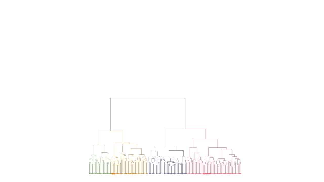
In the same way as colour and size represent station properties, the bending angle could be used to represent some property of the whole dataset – for instance the proportion of missing data. This may be explored in future posts.
Author: Chloe
Codes and data: browse on GitHub